
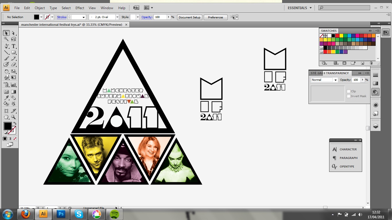
I have challenged my self to re-brand the Manchester International Festival 2011. Before the Easter holls my tutor group suggested I try to think of an alternate look for this years festival. The general consensus in our group, was that the 2009 festival branding really worked, but this year they had recycled the 'tree' theme from '09 and the whole look was quite poor. I have tried to give the festival branding a fresh/young/approachable feel, which are attributes I think are missing from the chosen look this year. Just having a go with typography and layout really, two things I still haven't mastered!


think this work is really good al
ReplyDelete