So my sisters gone over to France for a few days (alright for some!) So I've robbed her scanner, hoping to re-work some found imagery, and practice with digital collage. I love love love these posters, advertising perfume I think. I've had them for a couple of years now, and I won't be touching these as they are practically perfect!! Classic design + colour choices Circa 1950 I like them Very much!
Thursday, 28 April 2011
Sunday, 17 April 2011
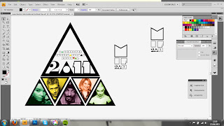
Mini Project - Branding for the Manchester International Festival
I have challenged my self to re-brand the Manchester International Festival 2011. Before the Easter holls my tutor group suggested I try to think of an alternate look for this years festival. The general consensus in our group, was that the 2009 festival branding really worked, but this year they had recycled the 'tree' theme from '09 and the whole look was quite poor. I have tried to give the festival branding a fresh/young/approachable feel, which are attributes I think are missing from the chosen look this year. Just having a go with typography and layout really, two things I still haven't mastered!
Friday, 15 April 2011
Recent work
I'm experimenting with CD cover design over the next few days, it allows me to utilize my design aesthetic, and gives me an end product to aim for. Things are going ok atm...but we'll see, will post updates on here!
Labels:
cd cover,
colour,
geometrics,
typography
Subscribe to:
Posts (Atom)


